Profile: Valentin
User posts
I just downloaded the most recent 3.80 version of the plugin and overwritten it in my plugins folder. I did as you asked, but still the category I want to hide in the fold out is present. If I uncheck the "show in menu" option, the category disappears from the whole menu but also the navbar at the top.
Greetings Jef,
In order to show a category in the top menu, you need to make sure it is not set as a Sub-category of something else. Go to your theme administration -> Catalog -> Categories and select the category you want to show in the top-menu and click Edit. There you need to change the Parent category to none and check the checkbox - Include in top menu. This will exclude it from the list of the other category and place it in the top menu on its own.
It seems you have updated your theme and plugins with the DefaultClean instead of the Uptown and this causes all of the problems. Follow the steps on how to update a theme - https://www.nop-templates.com/how-to-update-a-nopcommerce-theme.
Greetings,
you can easily fix this issue by changing the Social Network field to Select social network and then back to Instagram again. You will see that it makes your Subtitle Url a link immediately. It needs to have the account name before you select the social network so it can connect to their site and generate the link.
If you do not know where to manage the Social feed go your theme administation panel -> Nop-templates -> Plugins -> Social Feed -> Configure Social Networks and select the one you want (e.g. Instagram) and click Edit. Afterwadrs follow the steps above.
Greetings,
this has been fixed in the latest update of AjaxCart plugin for the Uptown theme. If you update the plugin the changes will apply to your site.
Greetings,
this issue has been handled. If you update your theme the changes will apply and you will not need to do any modifications. However, if you have made any customizations to your site that you do not want to lose, make sure to back up the modified files and merge them with the new ones after the update.
I want to implement this scenario using Nop Mega menu;
1- I have 5 main product category, So first level of menu must contain product categories.
2- each product category has up to 5 sub category in second level, for each category second level ( first subcategory ) shows like simple list menu ( but horizontally )
3- each second level sub category has several category or products, I want to show category with images and vendors of subcategories in multi column design.
Is it possible to do this using nop Mega menu?
Greetings,
the functionality of the MegaMenu does not allow such structure. You can show images only for the product category items and not for their sub-categories.
Greetings Christine,
to fix this, you need to go to your theme administration panel -> Nop-templates -> Themes -> Brooklyn -> Settings and in the Custom Head Styles section just add the following code:
.ui-dialog {
width: 900px !important;
padding-bottom: 20px;
}

.ui-dialog-content {
max-height: 65vh !important;
overflow: auto;
}
Our cleint is current on version 3.6 and we'll be running through the upgrade process to 3.9 shortly.
This is currently what we see on our phones:

Live site:
http://wwwthreestonehearth.com
Greetings,
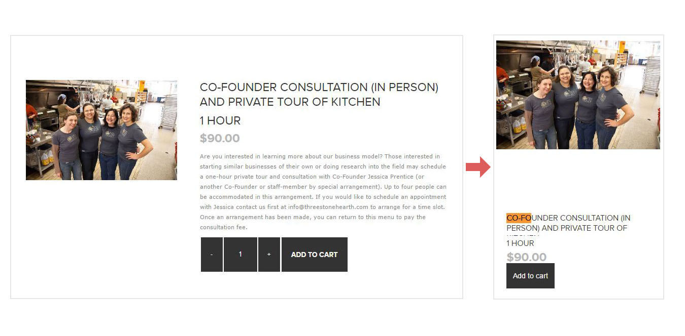
as we looked through your site, we saw that most of your products are In Store Only at this time and for those there are no buttons neither on desktop, nor on mobile. That is the case with the product that you took a screenshot of. For the ones that do have buttons on desktop, like - Co-Founder Consultation by Phone or Skype, the buttons are also there on mobile. I have attached images of this product as an example.

Overall we were not able to find a product with activated AjaxCart plugin, so if you can give us an example that would be appreciated, otherwise I guess this issue is not connected to this topic.
Best Regards.
Greetings,
you can easily fix this issue by going to your theme administration > Themes > Pavilion > Settings and add the following code in the Custom Head Styles section:
.attributes dl {
overflow: visible;
}

.attributes dl:after {
  content: "";
  display: table;
  clear: both;
}

.attribute-squares.image-squares li {
position: relative;
}

.attribute-squares .tooltip-container {
position: absolute;
display: inline-block;
top: 100%;
left: 0;
opacity: 0;
z-index: 999;
transition: opacity .3s ease;
-webkit-transtion: opacity .3s ease;
pointer-events: none;
}

.tooltip-header {
margin: 5px 0;
font-size: 11px;
text-align: left;
}

.tooltip-body {
width: 100px;
height: 100px;
}

.tooltip-body img {
max-width: 100%;
max-height: 100%;
}

.attribute-squares.image-squares li:hover .tooltip-container {
opacity: 1;
}
Have a nice day.


